A new identity for a national movement working to create a healthier, fairer Scotland.
Formerly Voluntary Health Scotland, the organisation was entering a new chapter with a new name and a bigger ambition: to become a more visible and influential national movement for health creation.
Health Creation Scotland works to reduce health inequalities, champion prevention and strengthen the role of Scotland’s third sector in shaping health policy and practice.
Our challenge was to create a brand that could reflect that ambition, authoritative enough to stand confidently alongside government, the NHS and national organisations, while retaining the warmth, humanity and collaborative spirit valued by its members.
Starting with strategy
We began with a focused version of our Diamond Method™, using facilitated discussion and Personality Cards to explore how the organisation was perceived today and how it wanted to be seen in future.
The existing brand was seen as trusted, collaborative, approachable and human.
The ambition was to become more inspiring, bold, progressive and ambitious — while remaining accessible, credible and warm.
That became the foundation of the creative brief.
Finding the idea
We explored a number of creative territories around advocacy, equality, collaboration and community.
But one idea kept coming through:
Voice.
Health Creation Scotland brings together the knowledge, expertise and lived experience of its members and communities, helping those voices reach the places where they can influence decisions.
That insight became the basis of the new identity.
Making voice visual
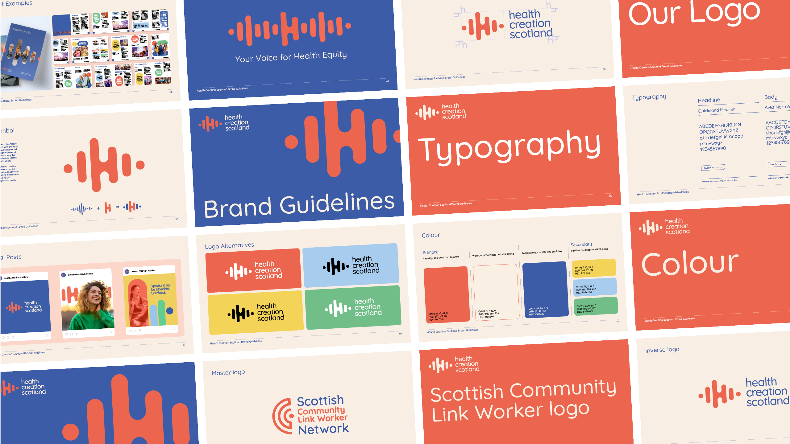
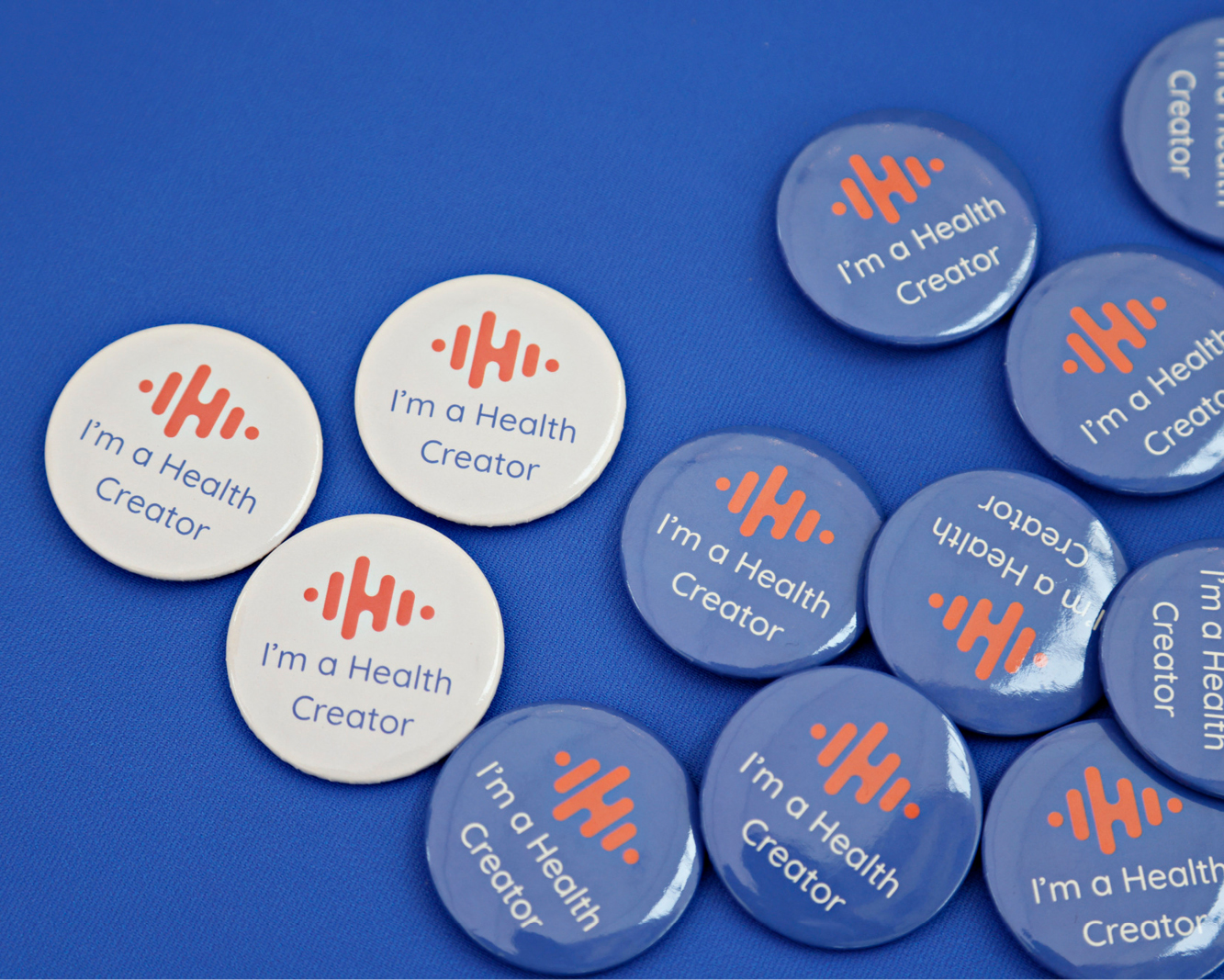
At the centre of the brand is a distinctive sound-wave symbol, representing voice, listening and amplification.
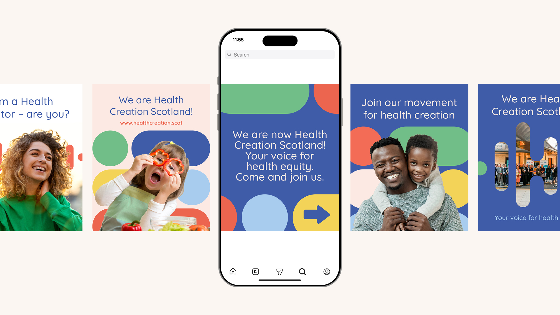
It also works as a wider graphic language, repeating and expanding across campaigns, publications, digital communications and events.
The identity deliberately moves away from traditional healthcare conventions. Rather than relying on familiar medical imagery, it focuses on people, influence and the creation of better health.
A confident blue brings authority and credibility, while coral and the wider supporting palette add warmth, energy and optimism — creating a brand that feels professional without becoming institutional or clinical.
Your voice for health equity
We also worked with the team to develop the tagline:
Your voice for health equity.
The new name expresses the organisation’s positive ambition around creating health, while the tagline makes its purpose more explicit.
“Your voice” puts members and the people Health Creation Scotland represents at the heart of the organisation, while “health equity” reflects one of the central issues it exists to address.
Together, the name, message and sound-wave identity create one joined-up proposition.
The result
The new identity gives Health Creation Scotland a more confident and distinctive national presence while retaining the trust and humanity of the organisation it has evolved from.
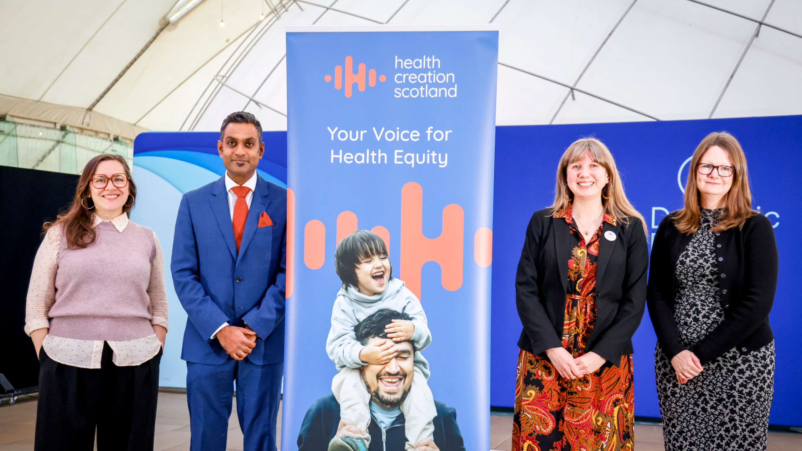
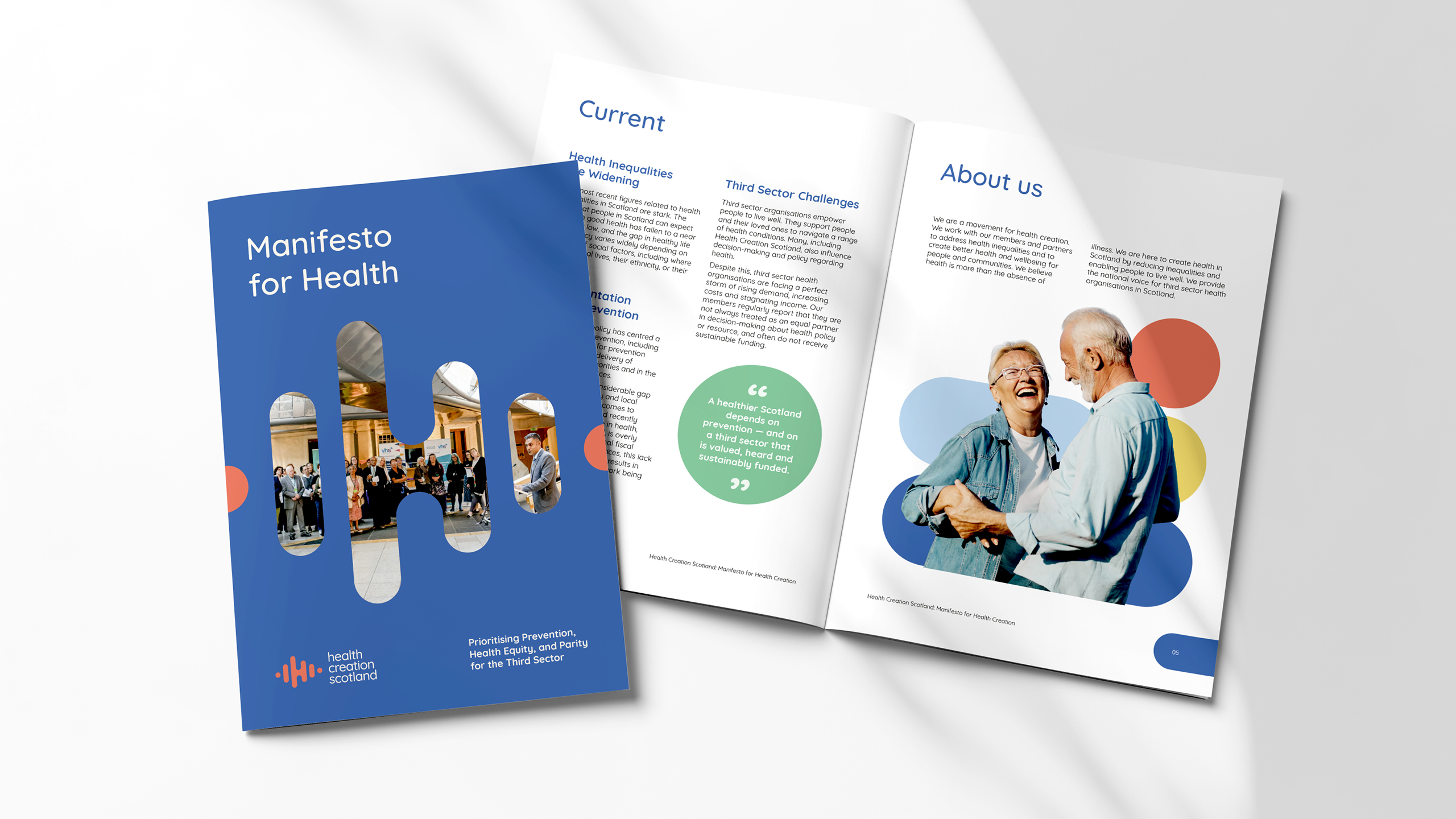
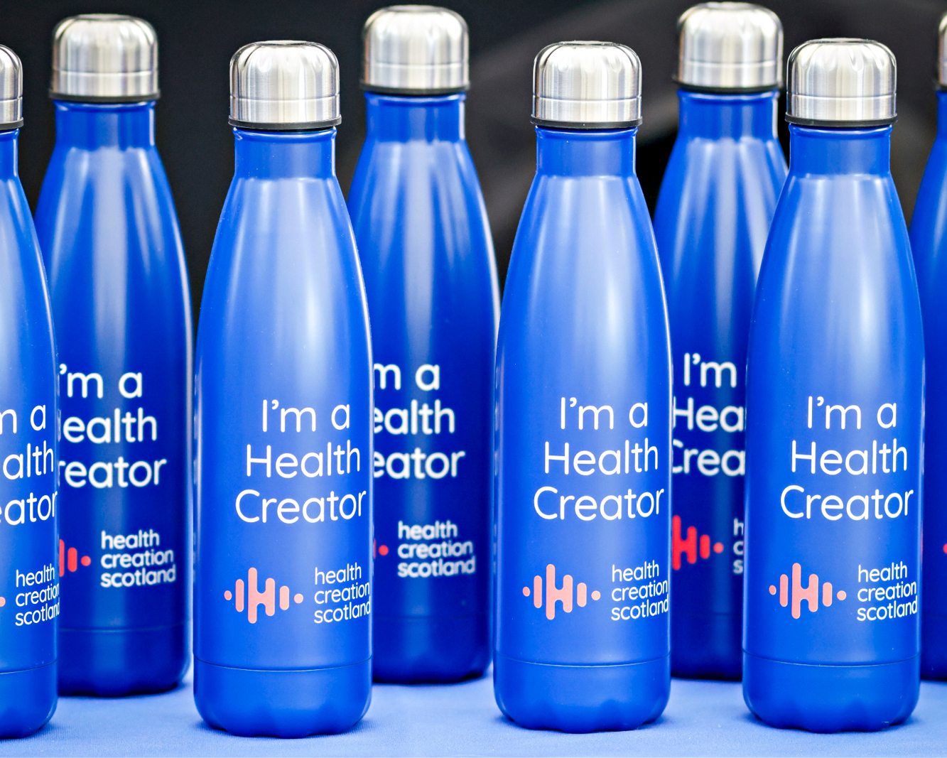
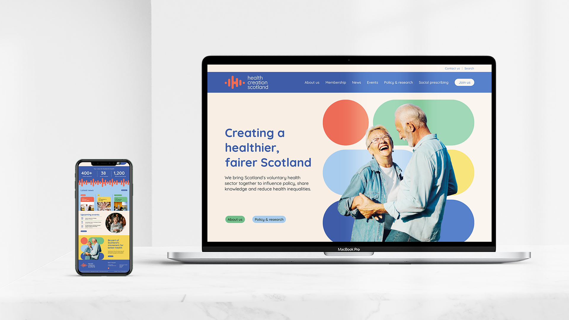
It has since been applied across communications, digital, events and publications, including the organisation’s Manifesto for Health Creation.
“They are a powerhouse of an agency. The team consistently went above and beyond what we expected.”
Tejesh Mistry, CEO, Health Creation Scotland
Tejesh also described the experience of working with Fifth House as a “genuinely cathartic process”, recognising the challenge, patience and collaboration involved in helping the organisation articulate who it was becoming.
For us, that is what a successful rebrand should do.
Not simply change how an organisation looks, but help it express more clearly who it is becoming.