Overview
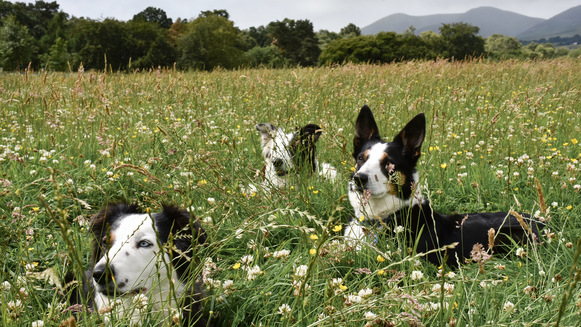
Firth Home Farm is a family-run working farm offering local Airbnb accommodation, with plans to expand into a commercial kitchen producing honey, jam, ice cream and other farm-made goods.
Set just outside Edinburgh, it’s a business in transition, growing from a place to stay into a broader rural offering.
We were brought in to create a brand and website that could hold both.
The Challenge
The business already spans multiple roles: farm, accommodation, and an emerging product range.
The challenge was to bring this together into a single, coherent brand, one that works now, and scales over time.
It needed to feel grounded in agriculture, credible in hospitality, and ready for retail.
The Approach
We built a brand designed to flex.
Rooted in the farm, but not limited by it. Considered enough for hospitality, but practical enough for product.
The idea was simple: create a system that can move easily between stay and produce, without changing tone or direction.
Everything is stripped back to what’s essential, letting the setting and offering do the work.
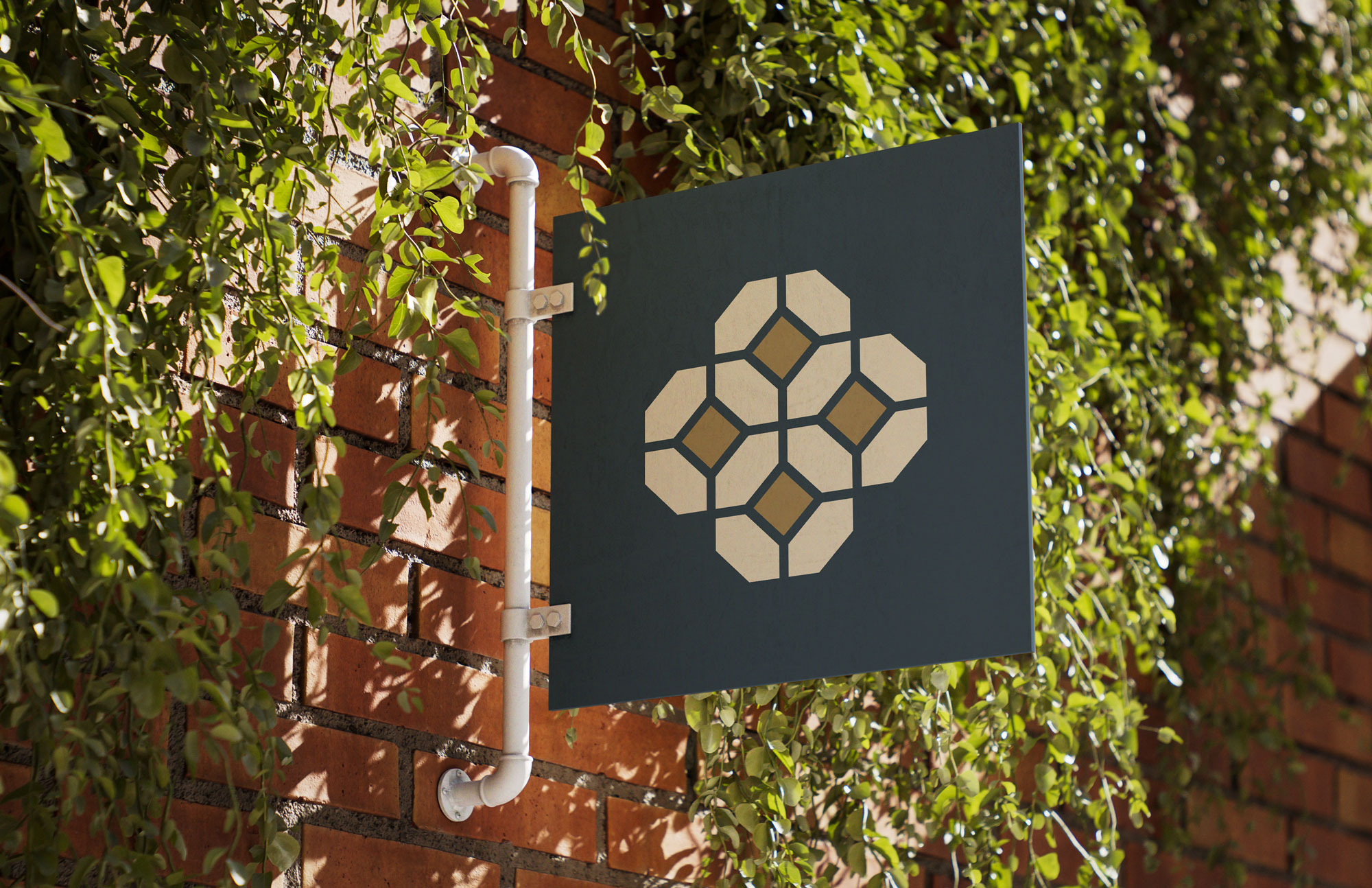
Brand Identity
The identity is calm, functional and confident, reflecting Firth Home Farm as both a working landscape and a growing rural brand.
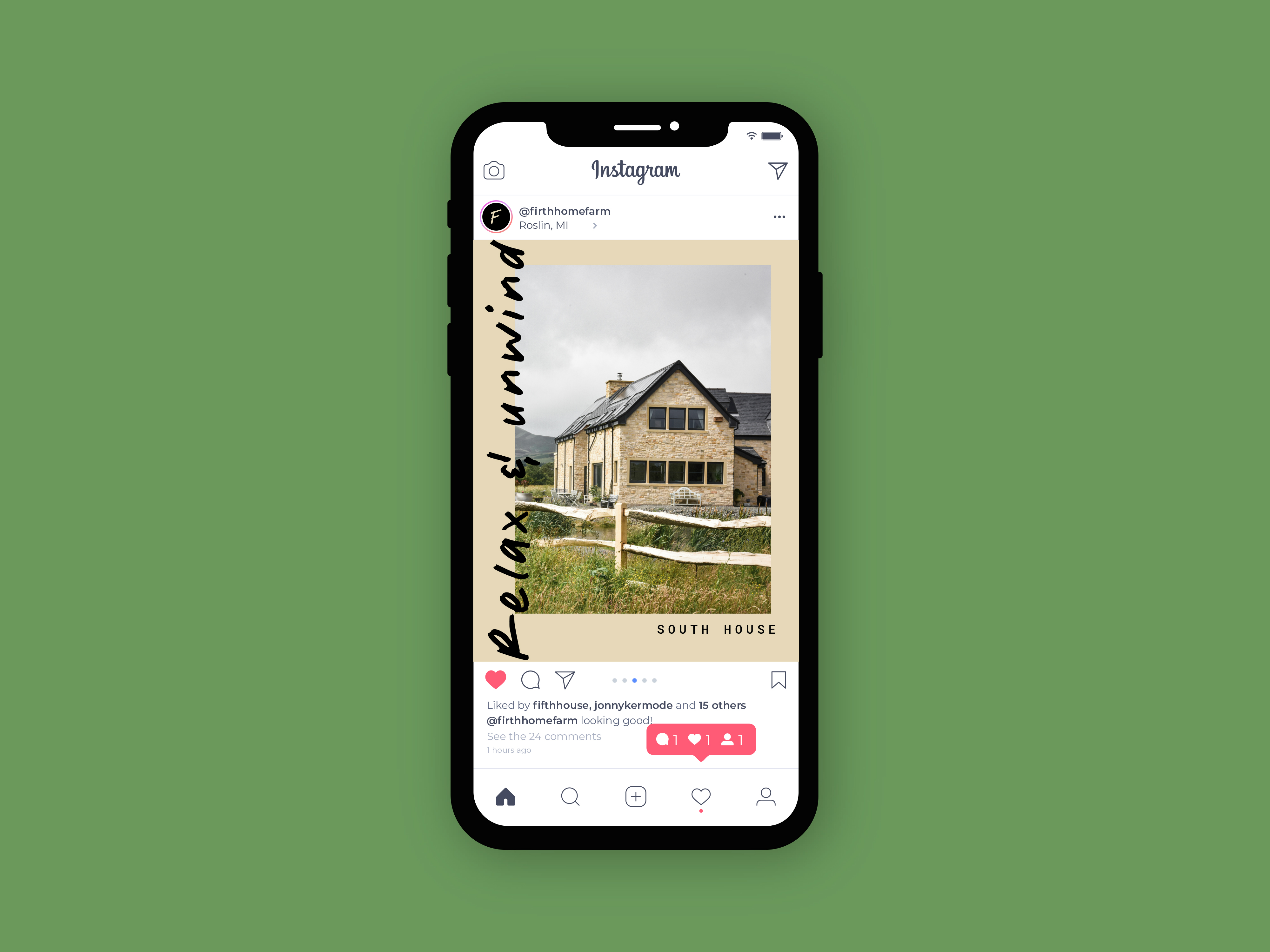
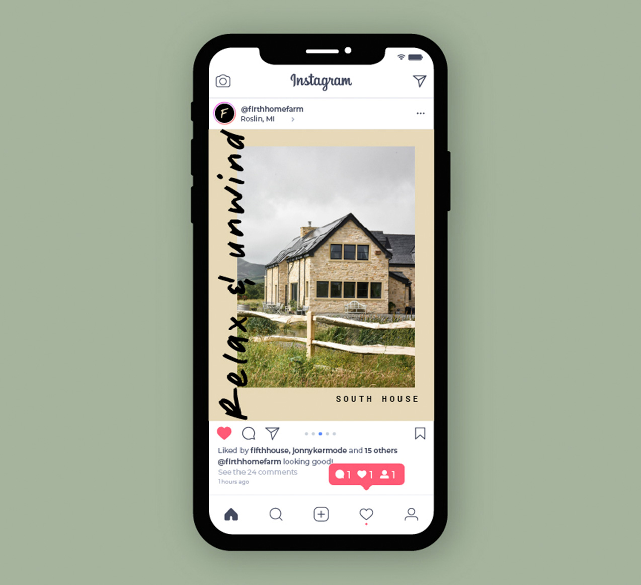
At its core is a simple, considered wordmark, balanced with a more expressive layer of handwritten typography. This introduces a human quality to the system — less polished, more immediate — echoing the hands-on nature of the farm.
This is extended through hand-drawn illustrations, used sparingly to add warmth and character. They feel loose and observational rather than decorative, reinforcing the sense of place without over-defining it.
The palette is drawn directly from the surroundings, muted earth tones, soft greens and sun-faded neutrals. Nothing loud or overly styled, just natural, seasonal restraint.
Together, these elements create a brand that feels lived-in, not applied. Structured enough for hospitality, flexible enough for product, and distinctive without trying too hard.
Digital Experience
The website brings together stay, story and future product into a single, cohesive experience.
It’s designed to feel open and unforced, mirroring the pace of the farm itself. Clear structure and generous spacing allow content to breathe, with a focus on simplicity over complexity.
Handwritten typography and subtle hand-drawn illustration elements carry through into the digital space, softening the interface and adding moments of character. These details are used sparingly, but intentionally, reinforcing the human, lived-in nature of the brand.
Navigation is straightforward, guiding users between accommodation and the evolving farm offering without friction. Each section is given room to exist on its own terms, while still feeling part of a connected whole.
The result is a digital presence that feels calm and grounded, but quietly distinctive, built to support booking today, and expand into product and commerce tomorrow.
Outcome
Firth Home Farm is positioned as a working farm with a growing offer.
A place to stay, and a brand in development.
The identity creates a clear foundation, one that supports expansion into produce, without losing what makes it distinct.
Simple, flexible, and ready to scale.