Honouring tradition and driving progress
‘Delving into the world of joinery, interior design, cabinet making and French polishing sounds like an awesome idea. So when Orocco called, we were all in.’
Jonny Kermode - Fifth House
Made By Orocco stands on its own two feet
Orocco has delivered some stunning joinery projects since 2012 as a main contractor. And it’s supported by its workshop, Made By Orocco. But there has been a persistent perceptual problem for customers. Because Orocco and Made By Orocco share a visual identity, opportunities for the workshop to secure projects from other main contractors has been somewhat stifled. It’s time for Made By Orocco to stand on its own two feet.
‘With this brand project with Fifth House, we wanted to bring clarity and focus to how we present ourselves to the world. And by creating a clear separation between Orocco and our joinery workshop, we give ourselves the best opportunity to invite more relationships and be the preferred choice for more contractors.’
Mark Ivinson - Director
Speaking to the team to capture stories
We got busy speaking to the Made By Orocco team. We spoke to the Directors, Mark and Jonny, the foreman, key machine men and the marketing team. We asked questions that helped us get to the truth of the business and the brand.
Visiting Edinburgh’s most unique joinery workshop
A common thread from the121s was that the workshop space was a key selling point. And so we decided to visit. Meeting the team in person helped us understand more about how the space could be used and talked about.
‘It was important to simplify our messaging, clearly distinguish our commercial and residential offerings, and craft more emotive, impactful headlines. We also wanted to celebrate the church - not just as our base, but as a place to invite customers.’
Jonny Blurton - Director
Presenting a rich and refreshed brand house
Following our meetings and research, we presented a new brand house to the team. It articulated truthful aspects of the brand:
- Proposition
- Mission
- Vision
- Values
- Key messages
- Position statement options
Ultimately, we ended up agreeing a position around ‘partnership’. This was not only true, but it meant that we would be sharing all the right messages when it came to inviting new relationships with interior designers, architects and main contractors.
Using the brand house as a springboard for renaming
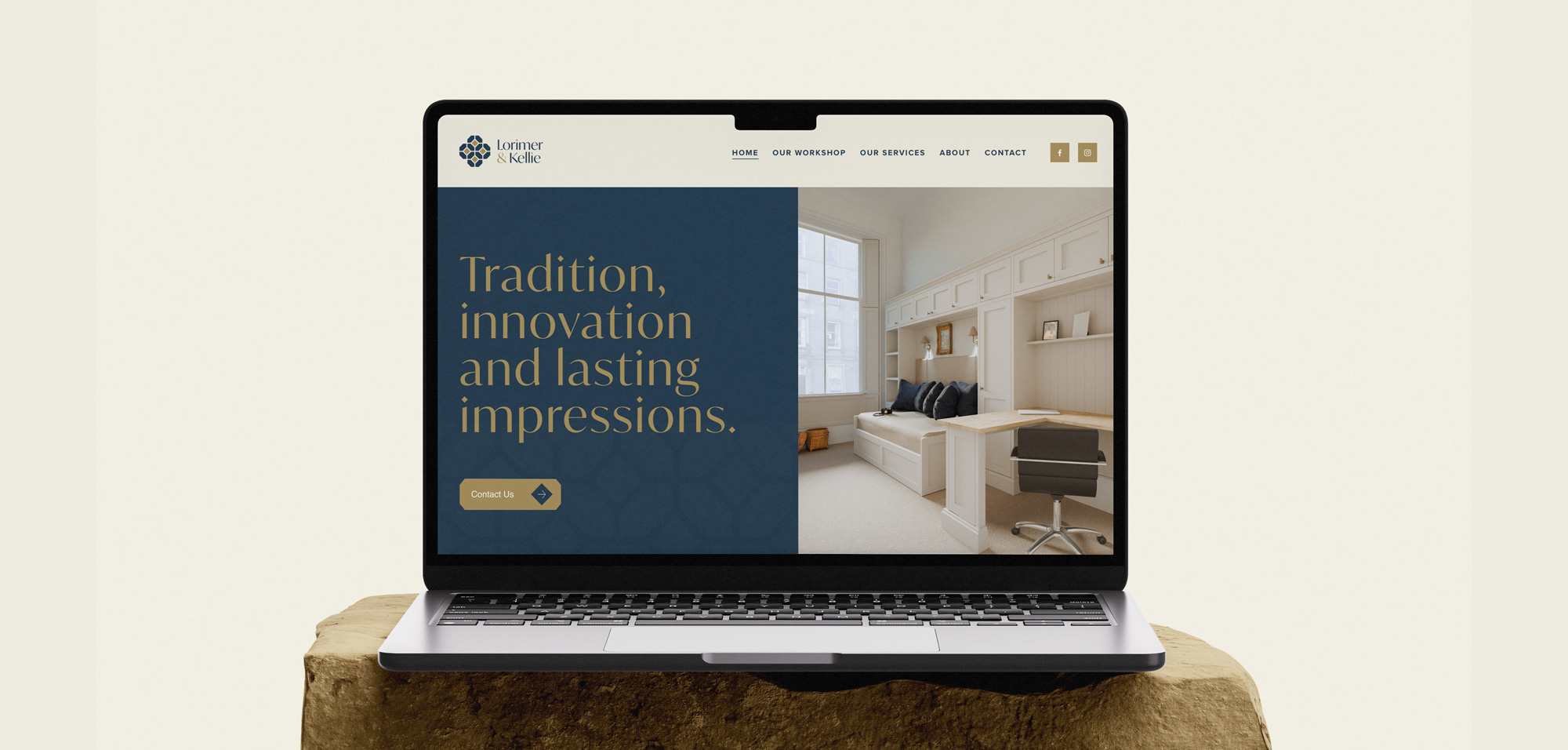
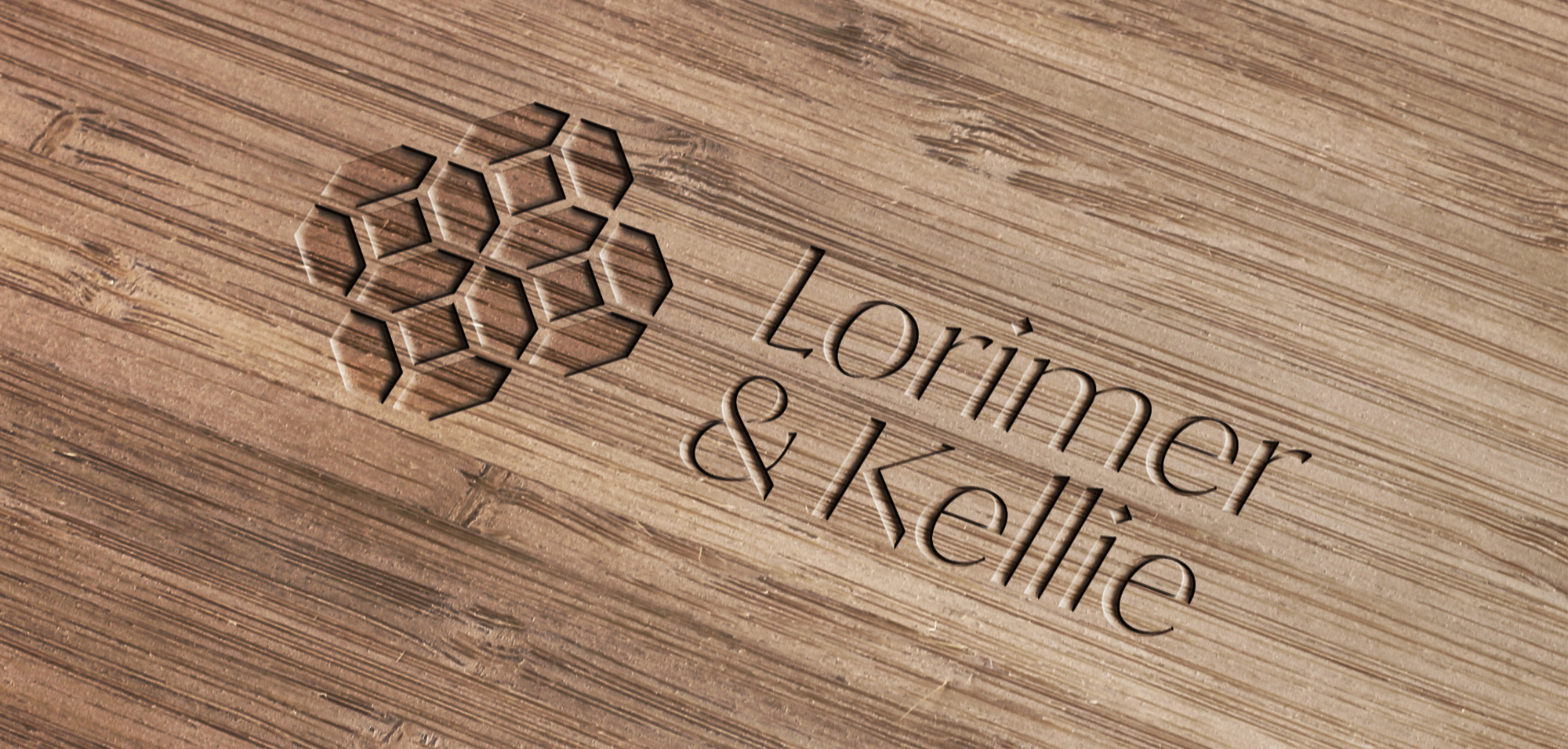
We created some initial routes and stimulus for renaming ideas. But it was the client in this case that eventually stumbled into the perfect name. Lorimer& Kellie oozes tradition, Scottish heritage and craftsmanship. It speaks toboth the male and female and has a nice rhythm and visual balance.
Designing a logo inspired by the brand and the church itself
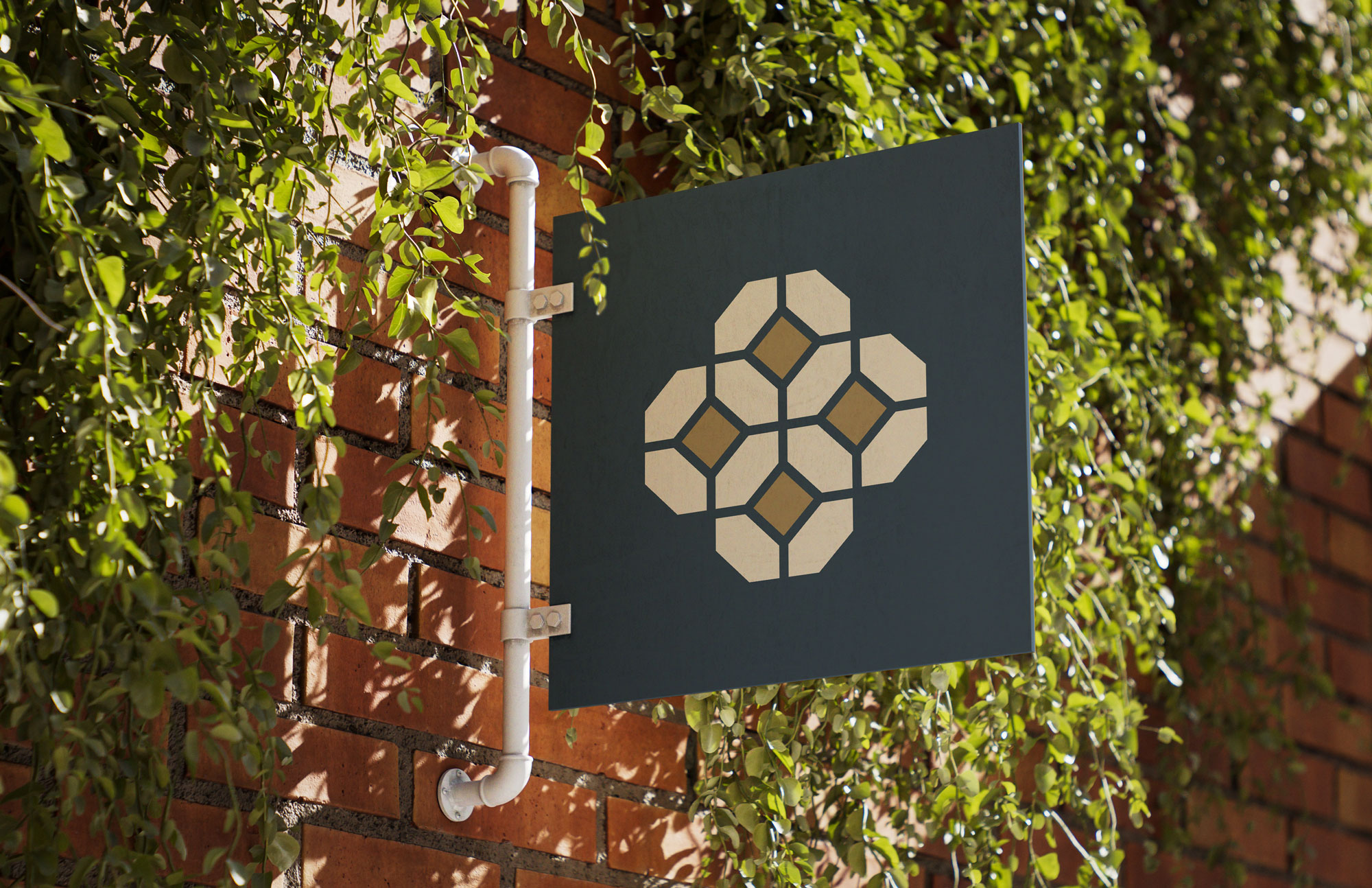
When we visited the church workshop, we were on the hunt for inspiration. We looked at stonework, arches, beams, patterns in wood and logos on old woodworking machines. We also took a trip upstairs to look at the machinations of the old clock in the tower. And from our investigations, we found some beautiful stained glass patterns that embodied ideas of collaboration, craft, beauty and heritage. Perfect logo stimulus.
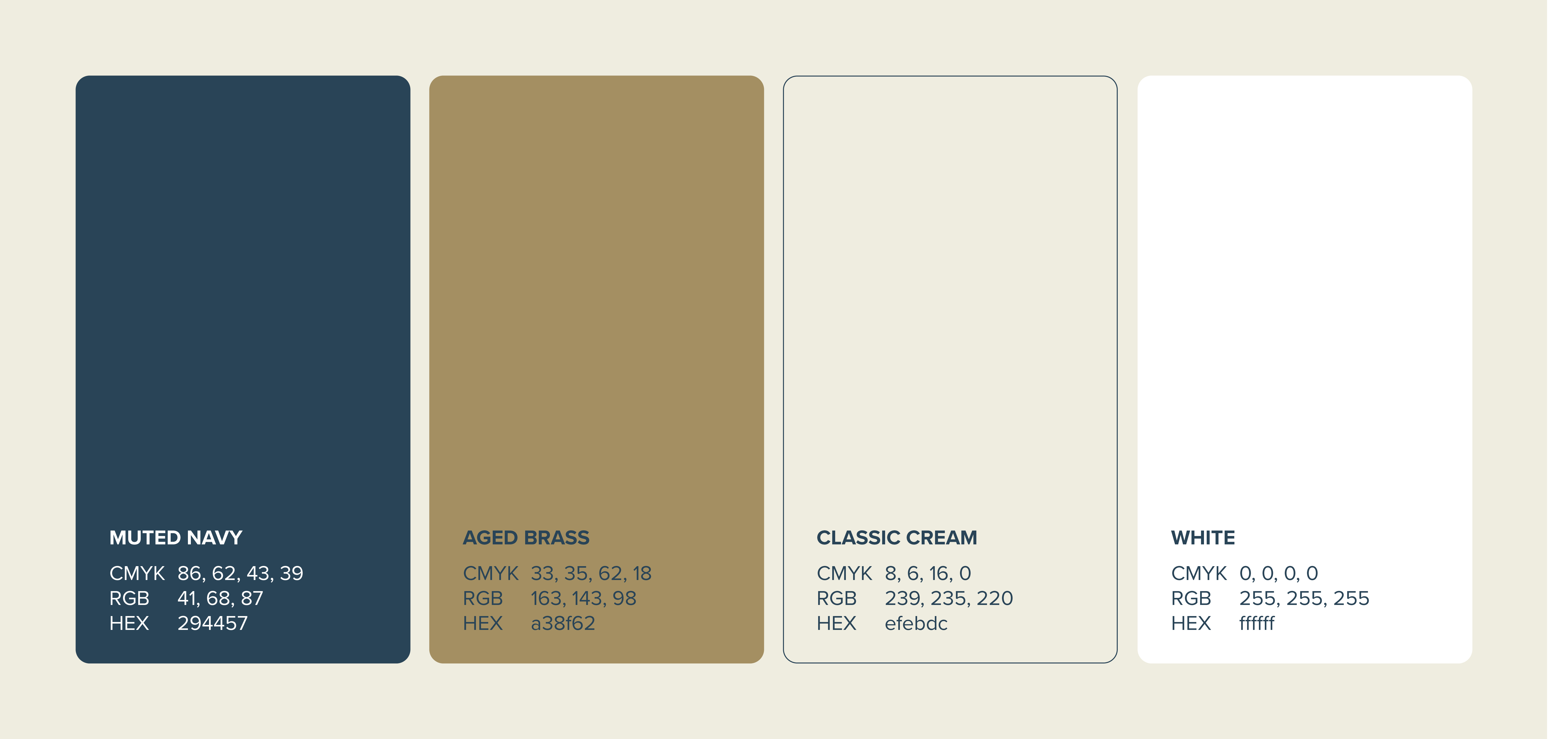
Choosing a traditional colour scheme that lets the wood speak
In consultation with the team, we opted for a colour palette that would stand the test of time. A light magnolia - a common interior woodwork colour -is complemented and accentuated by a solid Atlantic blue and gold. The combination gives an immediate premium feel, it’s sophisticated and whispers good taste without ever needing to shout.